Most all of us have them…
I certainly do. I bet if I were to check out your sewing space, you have them, too.
You know what I’m talking about….ugly fabrics.
I know, I know, beauty is in the eye of the beholder, but honestly, some fabric seems to be beyond help. You know…the kind of fabric you look at and wonder what in the world was the designer thinking when they came up with that?

In my quilting world, I have one way I get rid of most of my ugly fabric – I put it on the free table at guild meeting and walk away quickly. At this point, one of two things happen. Either someone decides (for whatever reason) they just have to have that fabric and takes it home with them, or I manage to sneak out of guild meeting before someone waves me down and returns it to me because literally no one at the meeting wants it. If the second option happens, either the fabric goes to Good Will or our charity quilt stash, or it’s thrown in the circular file. I can’t bring myself to throw chunks of any perfectly good fabric away because it bothers my conscience; however, I have no qualms about someone else throwing my fabric away. It can bother their conscience.
Nevertheless, ugly fabric is the topic I want to address this week – ugly fabric and what to do with it. I do realize that what is ugly to me may be perfectly appealing to another quilter. So, to give that fabric to a new home (see free table at guild reference above) is a completely acceptable alternative to allowing it to take up room in your stash. Because we all know how that works. It’s shifted around so much it finally ends up at the bottom of the heap, hopelessly wrinkled and still just as ugly.
However, if you can’t bring yourself to give it away (maybe dear Aunt Sue left it to you in her will or something), there are some things that can be done to minimize the unattractiveness and emphasize the use. After these suggestions, maybe you can breathe new life into that homely fabric.
Use it for quilting practice – If you have a long arm and it’s a nice, big piece of fabric, you can always use it to hone your long arming skills with. If it’s too small for that, use it to practice quilting on your domestic machine. Make some quilt sandwiches and stitch away. If you have enough to make a stack of small sandwiches, you can set those beside your sewing machine and have them ready for several practice sessions a week. This is a double bonus – you use that ugly fabric up and you get better at machine quilting.
Use it for leaders – Sometimes as you’re starting a seam out, your machine wants to “chew” your fabric. It gets lodged in your feed dogs and when you finally dig it out, there’s a hole in your good quilting fabric. Cut your unattractive fabric up in 2-inch squares, fold it double, and begin your stitching on this piece of material. This allows your feed dogs to go ahead and engage before your good quilting fabric goes over them, thus eliminating any “chewing” of the good stuff. You can reuse each leader several times before you need a new one.
Cut it up into small pieces – Sometimes a little of the ugly stuff works better than a lot of the ugly stuff. Most of the time, small pieces of the homely fabric will work in a quilt much more effectively than large chunks of it. I think it was Bonnie Hunter that said if the fabric is ugly, cut it up into small pieces. If it’s still ugly, you haven’t cut it small enough.
Calm it down with a neutral – And this neutral will usually be either a white, black, or gray solid or a tone-on-tone print that reads as solid. Ecru may work equally as well, but I’m not an ecru fan (so seriously, this could be a personal preference thing). The neutral will work surprising magic on making that ugly fabric appear not quilt so unattractive.
Find a quilt pattern that can take advantage of its ugliness – There are a few quilt patterns that work well with fabric we have no idea what to do with.

The first one is an “I Spy” quilt. I Spy Quilts are quilts (generally made for children) created with pictorial or novelty quilting fabrics —fabrics printed with objects that might not be obvious from a distance but can be identified during a closer look at the quilt. If your fabric has printed objects on it that are easily identifiable, it may be perfect for this kind of quilt.

If it is a large print that has regular repeats, it may be perfect for a Stack and Whack or Kaleidoscope quilt. These quilts amaze me for a couple of reasons. First, you can take the fabric, align it, cut it, and make your quilt. Then one of your quilting friends could take the same fabric, go through the same process, and neither quilt would have more than one or two of the same blocks. The other reason these quilts astound me is that they revel in ugly fabric. The uglier the fabric, the better the quilt looks. If you have a homely fabric with fairly large, regular repeats, try a Stack and Whack. You’ll be amazed.

Turning Twenty is another quilt pattern that can use almost any type of material, even ugly ones. The pattern is designed to fit a fat quarter. Each quilt block is made of only three pieces, so this is an easy quilt for even a beginner, particularly since there are no curves or points to sew. The completed quilt takes 20 quilt blocks made by mixing the fabrics. If you mix your unattractive fabric with some better-looking ones and throw in a neutral here and there, you’ve used up the material and made a nice quilt. This is a great pattern to use with stellar fat quarter packs…and those fat quarter packs where only a few of the materials are stellar.
Now let’s kick it up a notch. Let’s really look hard at that fabric you don’t find so appealing. I gave you some easy solutions about what to do with ugly material at the beginning of this blog. Let’s level this process up a bit. There are applique possibilities in those fabrics. You’ve just got to know what to look for and how to picture it. I can tell you my process – how everything works for me – and then it’s up to you to work it out in your own quilt studio.
For me, the process begins with my stash. We’re starting with what we have before we fabric shop. It’s always better to use up what you’ve already bought – it’s good stewardship and saves you money. With my stash (and I’m referring to fat quarters and everything three yards or less), those are arranged by color. Any fabric that is smaller than a fat quarter (and isn’t a precut) I consider a scrap and those are sorted by color and stored in bins. When I am designing my applique, I go to these sources first. Some parts of an applique pattern are easy to figure out – like leaves and stems. If’ I’m prepping these, I pull out the greens and make some decisions. (And let me throw in here, I only keep scraps that are approximately 8-inches square, so I don’t become overwhelmed with my scrappage).
But some other items require a little more imagination, and this is where pushing yourself to think outside the fabric box works in your favor. For the sake of illustration, let’s think about baskets and birds. In traditional and modern applique, both of these items get some serious play time. Now I want you to think about how often you see a variety of material with either a basket weave or feathers. I’ll wait a minute or two while you mull this one over….
(Cue music from Final Jeopardy….)
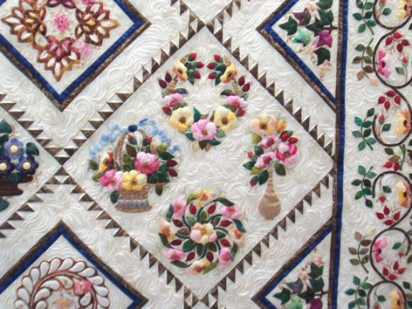
Times up. The answer is, “Not often.” It’s easier to find landscape fabric (material printed with bricks or stones or grass, etc.) than it is to find a piece of material that is printed with a basket weave or feathers. I truly “lucked out” with this small quilt:

I had a scrap of basket weave material I saved from back in the 1990’s. That’s nearly 30 years ago. Situations such as this – when you need something to give the impression of an object but don’t have the exact fabric to do this – is when you have to use a lot of imagination and a good pinch of creativity. This is where the ugly fabric can come into play. Sometimes that ugly fabric is exactly what you need to give the impression of baskets or feathers or rocks, or even flower petals. Let’s look at some examples.
For example, take this fabric:

This is kind of a bold print, and I’ve had it in my stash for a while. I’ve hung on to it for applique because you know what this would work well with? Birds. When I’m making an applique quilt that has critters on it or floral work, there are two ways these patterns are generally presented. The first is a stylized way (the kind of applique I’m using on my Language of the Flowers quilt) where the applique pieces are imaginative but not true to life. The second approach is a very realistic way in which the applique artist works to make the berries, birds, baskets, etc., look as accurate as possible.

Let’s say I wanted the birds in my block to appear as blue birds or blue jays and I wanted them to look as lifelike as I could get them. This material would be perfect. We all know that blue birds or jays aren’t solid blue or even only blue. They are created with different colors.
Next, let’s go back to leaves. A long time ago I urged everyone to try to always think creatively and if you find yourself stuck in the creative process, go for a walk. Look around at all the greens and browns that nature has provided. Leaves aren’t solid green. Stems aren’t solid greens, either. Neither is grass. These fabrics:


Would work perfectly for them, if you’re approaching your applique from the realistic point of view.
You’ll notice that none of this material is particularly attractive. In fact, if you saw it in a fabric store or quilt shop, you may not even give it a second glance unless it was on the clearance table, because we’re all going to check out the clearance table…This is the point where we, as quilt artists, have to start thinking out of our box. Leaves are more than just green. Birds are more than just red or blue. I can tell you in all honesty this process takes time and practice. I began training myself to do this anytime I had to purchase material for applique or was rummaging through my scrappage/stash to begin the quilt. If my quilt was leaning toward the very realistic end of things, I pulled everything that could possibly be used and spread it out on my cutting table. If I was looking for fabric to make leaves out of, I’d cut a reverse template:

Then I would lay that template down on the material to see how it would play as a leaf. I would do the same for flower petals, stems, birds, bunnies, berries…whatever applique pattern played a dominant role in my block, I’d make a reverse template and try it out on all the fabric that could be used in that quilt. Over a period of time – several years, actually – I could look at a piece of material and begin to see the possibilities it had in it.

One purchase I would encourage every applique quilter to make is ombre fabrics. I’ve touched on these before. These are so versatile and can run the spectrum of one color or several colors that undulate throughout the material. They hold endless possibilities for flowers, leaves, flower centers … just about anything you need. Another purchase I have found helpful is fabric depicting the item you’re appliqueing – such a material printed with leaves on it for appliqueing leaves. Make a reverse template and use it to help fussy cut your leaves. The veins in the leaves are already there most of the time, so it certainly helps make your applique look realistic.
Let me offer this word of caution here. Don’t mix stylistic applique and realistic applique together in the same block or the same quilt. Mixing those two styles makes the quilt look off-balance. While you can certainly mix applique techniques, don’t mix the two styles.
I hope this blog has given you a new appreciation of your ugly fabric, and maybe has even moved it from the realms of hideous to the area of endless possibilities. The more your practice thinking outside the box with those unattractive fabrics, the easier it gets. And this makes you a smart consumer of quilt fabric.
Until next week, Level Up Your Quilting!
Love and Stitches,
Sherri and Sam

3 replies on “How to Tame that Ugly Fabric”
There’s one more option for ugly fabric – at least the light-colored ugliest. You can paint it with fabric paint. It’s easy to make a color wash or ombre with fabric paint. And sometimes you can reverse the fabric and paint the back. The backs are often light-colored.
oh that was interesting! THanks for sharing all your knowledge. Especially the part about using the ugly fabrics for realistic applique.
I love ugly fabric myself, because they liven up a scrap quilt when used in the right amount. My quilting mother used to say that every quilt should have some ugly fabrics, and I kinda agree with her. It balances and makes the nice fabric look even better.
I agree! Every quilt needs some ugly fabric!