The World Needs
Strong Women.
Women who will
Lift and Build Others
Who Will
Love and Be Loved
Women Who Live Bravely, Both
Tender and Fierce.
Women of
Indomitable Will
—Amy Tenney
I think there comes a time in every quilter’s life where methods and circumstances converge at a point where a quilt is more than a quilt. It’s a work of art. It’s therapy disguised as needle, fabric, and thread. It’s sanity kept by sewing. It’s when the machine is almost a confessional or a few stitches shy of an altar call. In 2018 (which you may remember is my terribilis est annus), I needed such a quilt. Something that would occupy my mind (to stop it from thinking about everything that possible could happen) and challenge my talents. Thus, the hunt for a pattern began.
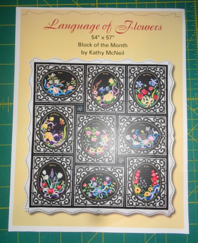
I found my quilt in Kathy McNeil’s Language of Flowers. If you don’t know who the award-winning Kathy McNeil is, stop right now and Google her. Look at her quilts and be in awe. She is simply amazing. I love her, her generous and sweet spirit, and her quilts and patterns. She is that wonderful blend of artist and quilter. Language of Flowers is a great fit for me because I like floral quilts and my it would feed my affinity for applique. Kathy also uses an applique technique known as Apliquick, which is also one of my preferred methods. There is a great balance of both hand and machine work with this quilt, which would allow me ample time to clear my head, pray, and be productive. So, my work started.
After raiding my fabric stash and purchasing some needed yardage, I began. Kathy gave several technique options for the black ovals that serve as the background for all of the flowers and embroidery. The one that made the most sense to me was the “Quilt it Before You Applique It.” A layer of thin, black batting was placed behind the black ovals and it was quilted in ½-inch cross hatches before any of the applique was sewed on. I chose this method for one primary reason: In my mind, it was the easiest. If I didn’t to the background quilting now, when I did finish the entire quilt top, I would have to go back and quilt in the background around all those tiny applique pieces. While not impossible to execute, it would be time-consuming and an overall pain in the rear. For several weeks, I marked the ovals at ½-inch increments on the background fabric and quilted them onto a rectangular piece of Hobbs black cotton batting. The batting would need to be thin, because when the top was finished and assembled, another layer of batting would be added in order to quilt the whole thing.

This was relatively mindless work. My hands stayed busy while I prayed through my morning prayer list. I pray twice daily. In the morning, before I leave to go to work, I pray through my list. Later in the day, one person on that list is specifically prayed for, along with both Meagan and Matthew. This is the way I’ve prayed for years. However, I’ve never been the type that can sit still and pray. My mind wanders too much. But give me something to keep my hands busy and I can focus. Marking and quilting those black ovals were perfect for prayer.
The next thing I had to decide was exactly how I wanted my quilt to look. Again, I want to emphasize that if you’re a seasoned quilter, the directions aren’t so much instructions as they are suggestions. You’re making the quilt. It’s your quilt. If you don’t like something or want to change methods and you have the skill set to do so, go for it. And this was where I was at. The pattern for The Language of Flowers called for machine embroidery and gold piping. While I was confident I could have undertaken both, neither of those appealed to me for my quilt. I opted to leave both of those out.
Now let’s talk applique – my very favorite topic. Kathy uses the Apliquick method for this and I think that any method similar (I use a hybrid method that I will talk about in another blog) would work best for this, even if you’re not crazy about Apliquick. The reason? The black background and overlapping bright colors. If the applique pieces aren’t interfaced by some method, the dark fabric beneath them will show through (called “shadowing), dulling the bright flowers and leaves. The “paper” used with the Apliquick method prevents that. If you’re dead set against using this method, then you will need to interface your applique fabric with either a thin, iron-on interfacing (the kind used in garment construction) or a piece of white fabric (more on this method in another blog) or opt to use a light background fabric.
I chose my applique fabric from my scrap bins. This is a great quilt for that – you can raid your scraps like crazy and reduce those. The applique material would have to be bright in order to hold its own against the black background. So, pastels, as a whole, were out. Batiks are a great choice (they work so well with so many flowers) as well as other brighter fabrics, such as the Grunge line, Connecting Threads Quilter’s Candy, ombre fabrics and Fossil Fern material. And while I used Kathy’s color choices as a guideline, I did veer from that if I didn’t have the right color or didn’t particularly care for the color. After all, it is my quilt.
It was when I sat down with my Cuttipillar Light Box and my Apliquick paper and Kathy’s pattern sheet that I hit a wall. I loved Kathy’s flowers, but the more I traced, the more I realized that appliqueing them could become a logistical nightmare for me. There are lots of tiny pieces. I tried two of her flowers – the small, pink flower and white flower on the far right of my block.

Then I stopped. At this point, I realized two things really quickly about me and this quilt. First, if I continued to use Kathy’s pattern for the flowers, I would literally have to undertake one unit at a time. Each flower and the ribbon had so many pieces. If I tried to trace them all at once and then cut them out, a lot would get lost in my translation – even if I took the time to label and number each piece. The second thing I realized was that the flowers on this pattern were very realistic and very detailed. My applique tends to lean towards the more stylized end of things – it tends to be very “lean and clean.”
I also came to the conclusion that while I may be able to carry my stylization in some of the units, it wouldn’t work for everything. I would need to use the original pattern in some instances. I chose to stick to Kathy’s rendition of the ribbons and hand embroidery. But the leaves (each leaf is slightly different in the pattern), flowers, and buds would have to be drawn from another source. I did use the pattern as a reference for the size of the flowers, leaves, and buds, but I turned to another applique artist: Deborah Kemball.

There are very few quilting artists and designers that I buy everything they’ve ever published. But Deborah Kemball is the exception. I have every book and pattern she has produced (at least I think I do). She works only with floral design and her patterns are wonderfully streamlined with a touch of whimsy. Her work looks complicated – and some level it is – but she breaks it down into steps that makes things pretty simple. And while she does not use the Apliquick method (she uses the needle turn method), she does gives directions on how to line your applique pieces so that the background does not shadow through. I find it wonderful that several of her pieces were appliqued on a red background. At this point, if you’re curious about the Apliquick method or you already use it, please note that almost any applique pattern can be “converted” into Apliquick use. It’s remarkably similar to the freezer paper method, you just use a glue stick instead of an iron.
Once I prepped my pieces, I had to lay them out. It’s recommended that you draw the pattern out on a piece of clear plastic to make an overlay. This will show you where to place all the pieces. However, in my nearly 33 years of quilting, I’ve done a difficult applique pattern or two and have developed a pretty good “eye” about layouts. Again, directions are merely a suggestion to me and not a hard, fast rule. I didn’t use the plastic overlay, but if you’re newer to applique than I am, you may want to use that technique to help you with the layout. The main concept that I had to keep in mind was I had to keep a consistent ¼-inch margin all the way around the oval because there is a frame that goes around the applique and I needed the pieces to stay within the frame.

After every piece was laid out, I glue pasted it in place and stitched it down. For me, this is the fun part. Lots of appliquers use silk thread. I do not. It has always been a constant battle between silk thread and me. I have never been able to knot it correctly and have always had issues with it slipping out of the eye of my needle. For hand applique, I use fine cotton thread (about a 50 or 60 weight) that matches my applique piece.
Now it was time to consider the oval frame and the scroll work. I wanted a fabric that would enhance the applique pieces and had a fairly firm weave. That firm weave was necessary. Take a look at that oval.

Normally, with curved edges (such as with leaves), the applique piece is cut on the bias of the fabric. This bias cut allows for ease of turning. However, with the oval piece there were several issues I had to consider, the first being the width of the oval frame itself. It’s narrow – finishing at ½-inch in width. If I did cut the piece out on the bias, I would have to deal with the possibility of stretching the fabric. Remember from my other blogs about cross grain, straight-of-grain, and bias grain, it’s the bias cut allows for the most stretch. If this oval piece got stretched in any way, it would be nearly impossible for it to fit correctly around my applique and it would not lay flat against the background. If I cut the oval on the straight-of-grain, it would be difficult to turn the edges under smoothly, as this cut allows for the least amount of stretch. I had to cut the oval on the cross grain. This would allow for enough ease to turn the fabric under without the threat of the oval getting stretched out of shape. The firm weave would keep the fabric from fraying, as the inside curve of the oval would have to be snipped frequently to permit the material to turn under smoothly.


A firmly woven fabric is also needed for the scroll work.

One thing I appreciate about Kathy McNeil is that she is not afraid to use mixed methods. The scroll work is machine raw edge appliqued. Tightly woven fabrics are always needed for raw-edge applique, as that method takes a lot of abuse from the feed dogs and the stitch (both the type of stich chosen and the shortened length and width). A Batik would fulfill everything I needed the material to do. I pulled this fabric from my stash.

It would match and enhance my flowers beautifully. And while the flowers printed on the material are 1 ½-inch in diameter, the fabric is cut in narrow widths – so the flowers don’t appear so much as “flowers” as they do spots of color. It is as close to perfect as I could wish for. I appliqued the inner curve of the oval frame to the background by hand. The directions call for it to be machine appliqued with transparent thread, but I was a little antsy about that. I was a little afraid the machine work would stretch the oval – something I am avoiding at all costs. I used raw-edge machine applique for the scroll work.


At the beginning of this blog, I mentioned that this quilt is more than “just a quilt” for me. The hand sewing and prep work allowed me to meditate and pray. It slowed my world down enough for me to pause my racing mind. However, this quilt is highly symbolic. There was so much chaos in my world – it seemed as if everyone I loved was facing some type of trial – especially the women in my life. I’ve mentioned before that I don’t have a sister. I have a terrific brother, but no sisters. The women that I’m close friends with tend to fill that role. I love this circle of “chosen” family. That’s why I began my blog with the quote from Amy Tenney. These women are also behind the reason I chose certain flowers for the applique. Historically, flowers have held special meanings. Long ago, if a person received a certain bloom from someone, they knew what the sender was conveying without a word spoken. Along the way, a lot of these meanings have been forgotten, but not in this quilt.

The white bud to the far right is Jasmine. Jasmine means “Gift from God.” I put this bud here especially for my daughter, who was recovering from her cancer surgery when I started this quilt. Her full name is Meagan Elizabeth – which literally means “Precious Gift Sent from God.”

The pink bud beneath the Jasmine sprig is a Bush Rose. It’s meaning is “New Beginnings, Promise, and Hope.” Bush Roses are different from the shrub roses that grow in a lot of yards. Bush roses are smaller and today are grown most frequently in pots. However, they still grow wild. There is a beautiful thicket of them across the street from my home. I look forward to seeing them in the Spring because when they bloom it means that warm weather has returned. Winter is over. To me they are a perfect symbol for the women in my life. They face hard times. They get through those periods with compassion, strength, and dignity. Instead of withering beneath the “winters” of their lives, they come out even stronger than before.

The large, pink flower that’s centered in the center of the blue ribbon is a stylized Magnolia. Growing up in the South, I’ve seen Magnolias in almost every yard. At Christmas, they often cover mantles and are in door wreaths. They’re fragrant, beautiful, and look oh-so-delicate. But remember that wonderful movie Steel Magnolias”? Southern women aren’t called that for nothing. Magnolias are deceptively fragile looking. In reality they’re a hardy flower that can stand up to our withering heat or our notoriously dangerous hurricanes. Let the wind blow through, but a Magnolia tree will remain standing, most of the blooms intact. It’s no wonder that a Magnolia means “Great, Splendid, Beautiful, and Dignified.” I had my mom in mind when I put that flower in the center of the block. Mom will be 80 in January 2020. She’s owned her own businesses then sold them and began a second career working for the City of Graham. She retired from there and has a third career teaching stained glass art at the local community college. She’s a gracious widow that lives independently. She’s been the symbol of hospitality and care for our family for as long as I can remember. A sweet, southern lady with a spine of steel – that’s Mom. A true steel magnolia.

On either side of the applique are Pansies. Pansies always make me happy – their bright colors just make any day a little happier. They look as delicate as the Magnolia, but again, that’s deceptive. They’re planted in the fall and bloom throughout the colder months. In the spring, they’re pulled up and replaced with something far less colorful – like Marigolds. Pansies represent “Loving Feelings.” I cherish the women in my life. And I wish all of us women would cherish each other instead of tearing one another down. We need to build each other up. We may disagree, but as time goes on and our lives alter – children grow up and our families change – we need our female friends as much as we need our close relatives. Don’t take each other for granted.

The white flowers on the far left are daisies. That’s another flower that makes me happy. I live in a rural area of Guilford County and there are hundreds of these white flowers along the banks of the ditches and the sides of the road, The meaning of daises is “Purity and Innocence.” While this particular flower was chosen as a “filler” applique (something small to use in blank areas), it still holds special meaning for me. My kids used to pick handfuls of daisies for me. I would always put them in a vase and sit them on my windowsill in the kitchen. It was the first thing I would see when I made my way to the coffeepot in the morning. They remind me that it’s important – that no matter what life throws at you – to somehow maintain that childhood innocence, wonder, and trust we have in God.


Okay, so why did I go through all of this explanation? There are three reasons. First, I said at the beginning of this year, part of my Quilt with Passion promise was you would get to know me a little better. I’ve spent lots of time and lots of past blogs in teaching mode. I wanted this year to be a bit more informal. No one quilts in a void. Our past invades our present through color choice, methods, and memories. We all are sum totals now of what we once were. Second, I want to encourage you to take a quilt pattern and make it yours. Once you’ve garnered the skill set, change the pattern. Alter it. Make it yours. You can always give credit to the designer and pattern that influenced you, but make your quilt your quilt. Don’t be afraid to do so. And third, believe it or not, this blog sets up the theme for 2020. We’re quickly approaching the end of 2019 and I’ve already got some ideas ready for next year!
Until next week, Quilt with Passion!
Love and Stitches,
Sherri and Sam

6 replies on “Making it Mine”
This is beautiful. I learned so much from you today. Thank you.
Thank you!
Wow! Thank you for taking the time for a beautiful and very informative post. I almost always make a pattern “mine” but I loved how you explained each step of your process. I can’t wait to see what you have planned for 2020.
Thank you for taking the time to read it! It was kinda long but I wanted to really explain what I was doing.
Thank you! This post is a wonderful example of rising above, and you have. We know that prayer is powerful and you showed that, once again.
Be well, my friend.
Love you, girl!